Interesting Trivia

‘BluePencil’

Why BluePencil? Many people ask us curiously.

Traditionally, a blue pencil used to be an editor’s tool. During the time when ‘galleys’ were used for a manual pasteup, making changes was not as simple as it is now. So when editors made corrections on galleys, they used a special blue pencil that would not photocopy or print, and was thus safe to mark with.

‘blue-pencil’ means to edit, revise, or correct. The word is also used as a transitive verb — blue-pen·cilled or blue-pen·cil·ling. When we started in 1993, this was the only name we thought of, and it seemed apt because, well, bluepencilling is what we do!

bluepencil-logo-old

When we first started, our logo represented a sheet of paper, with ‘bluepencil’ written at the bottom.

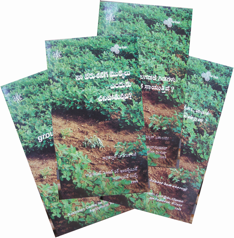
But as we went along, we changed it to the present one, which was inspired by a set of four books we did for an organisation called Agriculture, Man, Ecology (AME), Banglore, India. These books, titled “Why are my groundnut plants dying?” were done in four languages – English, Telugu, Kannada and Tamil. They looked good when placed together like a fan… giving us the idea for the present logo.

First client

Mrs Asha Dua, a writer, came to Sadhana about a month after BluePencil was started in 1993, for the editing of her book titled, ‘The generous miser’, a biography of Mir Osman Ali Khan, the last Nizam of Hyderabad.

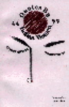
We also did this book of quotations for her. Thank you, Mrs Dua, for giving us our first manuscript to edit.

Our first cover design

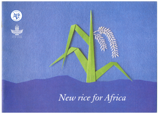
New rice for Africa, for the West Africa Rice Development Association (WARDA), then at Ivory Coast, West Africa. We did an origami rice plant, pasted real rice grain, and then scanned the cover. This gave it a nice 3D effect. We then used rough, textured Strathmore paper, which also added to the aesthetics of this cover.

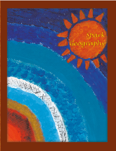
Hand-crafted cover design

This cover design was finger-painted (sitting on the floor) by Sadhana and daughter Ragini. It was an attempt to improve upon the Photoshop design Vijay was trying to develop.

The idea was to give an interesting texture to the image of the earth’s layers depicted.

When scanned, this ‘rough’ artwork looked really good, and when the lettering was done, it was just the thing the publishers wanted!

Our Philosophy

200%

Deadlines

We always meet them.

Words of Praise

We would be happy to hear from you